Why a Simple Design Has Been Fascinating People for Years
Sometimes the most surprising discoveries aren’t hidden in ancient ruins or secret codes—they’re hiding in plain sight. You look at something every single day, for years, and then suddenly… you see it.
And once you see it, you can’t unsee it.
That’s exactly what happens when people take a closer look at the Starbucks logo.
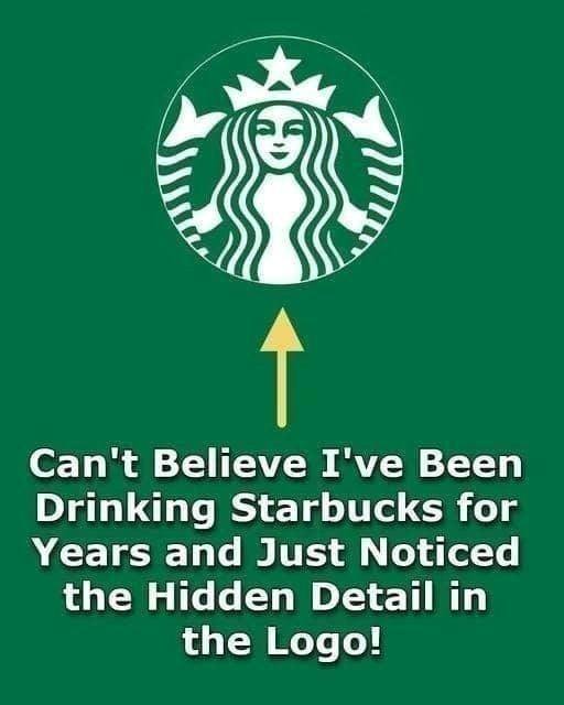
At first glance, it’s simple: a green circle, a white crowned figure in the center, long flowing hair, a calm expression. Instantly recognizable. Familiar. Comfortable. It’s a logo most people have seen hundreds, maybe thousands, of times.
But then someone points out a hidden detail—and everything shifts.
The Figure at the Center: More Than Just a Woman
The image in the logo is not just a woman. It is a two-tailed siren, a mythical sea creature from ancient maritime folklore.
A siren, in mythology, was known for luring sailors with her enchanting song. Over time, sirens became associated with mystery, temptation, and the sea.
Starbucks chose this imagery deliberately.
Why?
Because the company’s origins are tied to seafaring trade routes—coffee beans transported across oceans. The siren represents maritime history and the global journey of coffee.
But the “hidden detail” most people suddenly notice is not just that she’s a siren.
It’s her two tails.
The Detail People Suddenly Notice
Look closely at the lower half of the logo.
The siren’s flowing hair frames her face, but beneath that, there are two curved shapes extending outward symmetrically on each side.
Those are not decorative waves.
They are her twin fish tails.
Once you recognize them, it becomes obvious.
The symmetry.
The curved fin shapes.
The framing around the body.
Suddenly the logo transforms in your mind from a crowned woman with flowing hair into a mythological mermaid-like figure holding her two tails.
And that’s the moment people say:
“OMG, I cannot unsee it now!”
Why It Feels So Shocking
You might wonder—why is this so surprising? It’s been the logo for years.
The answer lies in how the brain processes familiar symbols.
When we see something repeatedly, we stop analyzing it deeply. Our brains switch into recognition mode rather than inspection mode.
You don’t study the Starbucks logo when you grab your coffee. You recognize it instantly and move on.
This is called cognitive efficiency. The brain conserves energy by avoiding unnecessary analysis of familiar visuals.
So even though the two tails are clearly there, most people never consciously register them.
Until someone points them out.
The Power of Negative Space and Symmetry
The logo is cleverly designed using symmetry and stylization.
The tails blend seamlessly into the circular border. The lines are smooth and abstract enough that your brain prioritizes the face over the body.
Humans are wired to focus on faces first. That’s where attention naturally goes.
Once the face is recognized, the rest becomes background.
The hidden detail is not hidden by invisibility. It’s hidden by attention.
The Evolution of the Logo
Interestingly, earlier versions of the Starbucks logo made the siren much more explicit. In the original 1971 design, the full two-tailed siren was visible in a more detailed and less stylized form.
Over time, the logo was simplified. The image became cleaner and more abstract. The tails remained, but they were softened into flowing shapes.
That subtlety is what makes the modern “discovery” so surprising.
The detail didn’t appear recently.
Click page 2 to continue


